
Gnawty by Nature
Healthy treats, punk spirit
Copywriting
Naming
Packaging
Tone of Voice
UX/UI
Visual Identity
Gnawty by Nature is a line of organic, human-grade dog treats that were created as part of Unilever’s MADE LOCAL initiative. This branding, packaging, and web design project needed to reflect the founder’s identity, stand out from mass-produced competitors, and appeal to ingredient-conscious pet owners. The concept, “for dogs who don’t follow the pack” was inspired by the founder’s roots as a punk artist and was designed to capture the spirit of rebellion and individuality.

The Challenge
The key challenge was finding the right balance between attitude and trustworthiness: the identity needed to be bold enough to stand out and reflect the founder’s personality, while still reassuring buyers about the quality and care put into the treats.
The Challenge
The key challenge was finding the right balance between attitude and trustworthiness: the identity needed to be bold enough to stand out and reflect the founder’s personality, while still reassuring buyers about the quality and care put into the treats.
The Challenge
The key challenge was finding the right balance between attitude and trustworthiness: the identity needed to be bold enough to stand out and reflect the founder’s personality, while still reassuring buyers about the quality and care put into the treats.

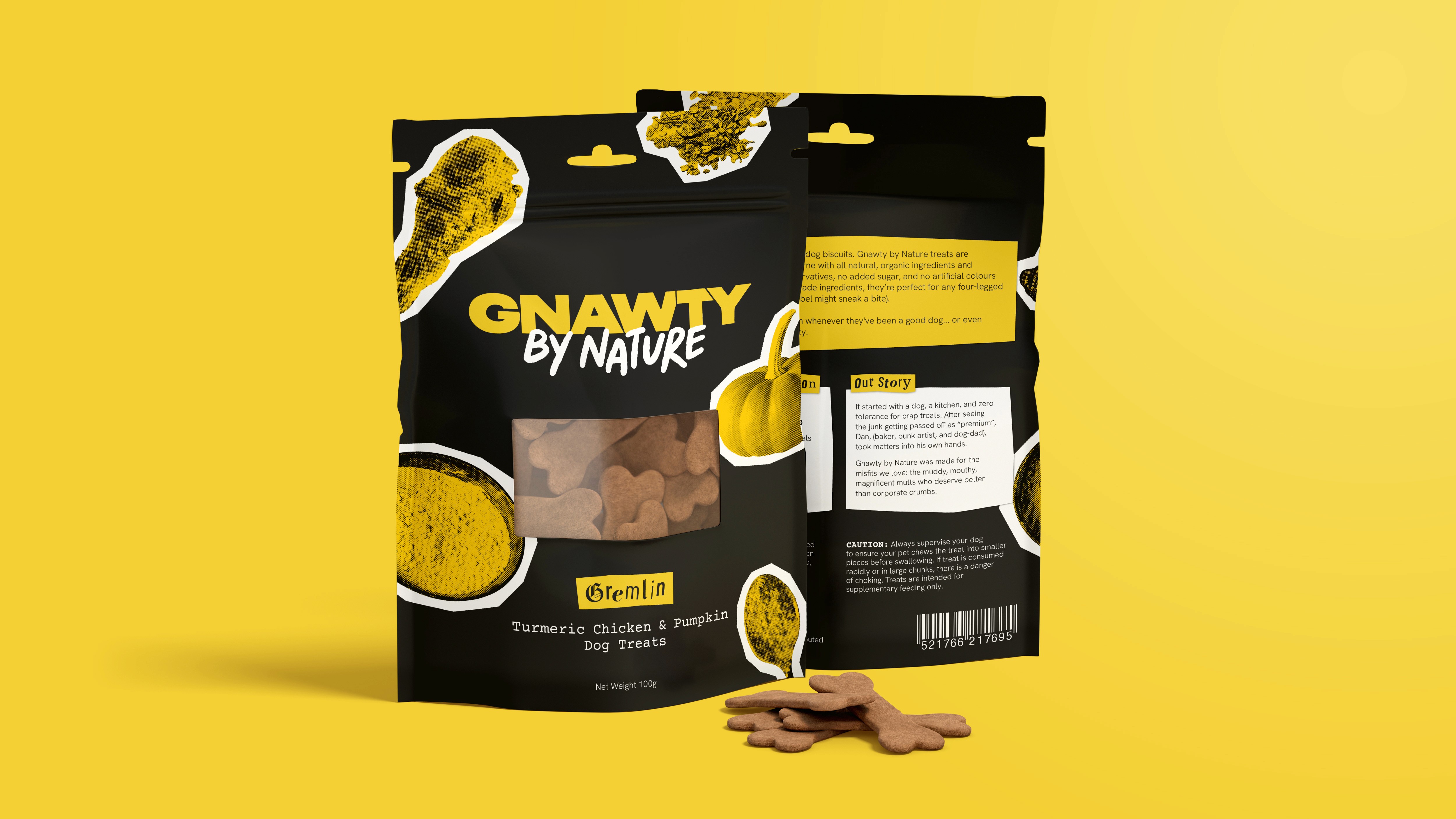
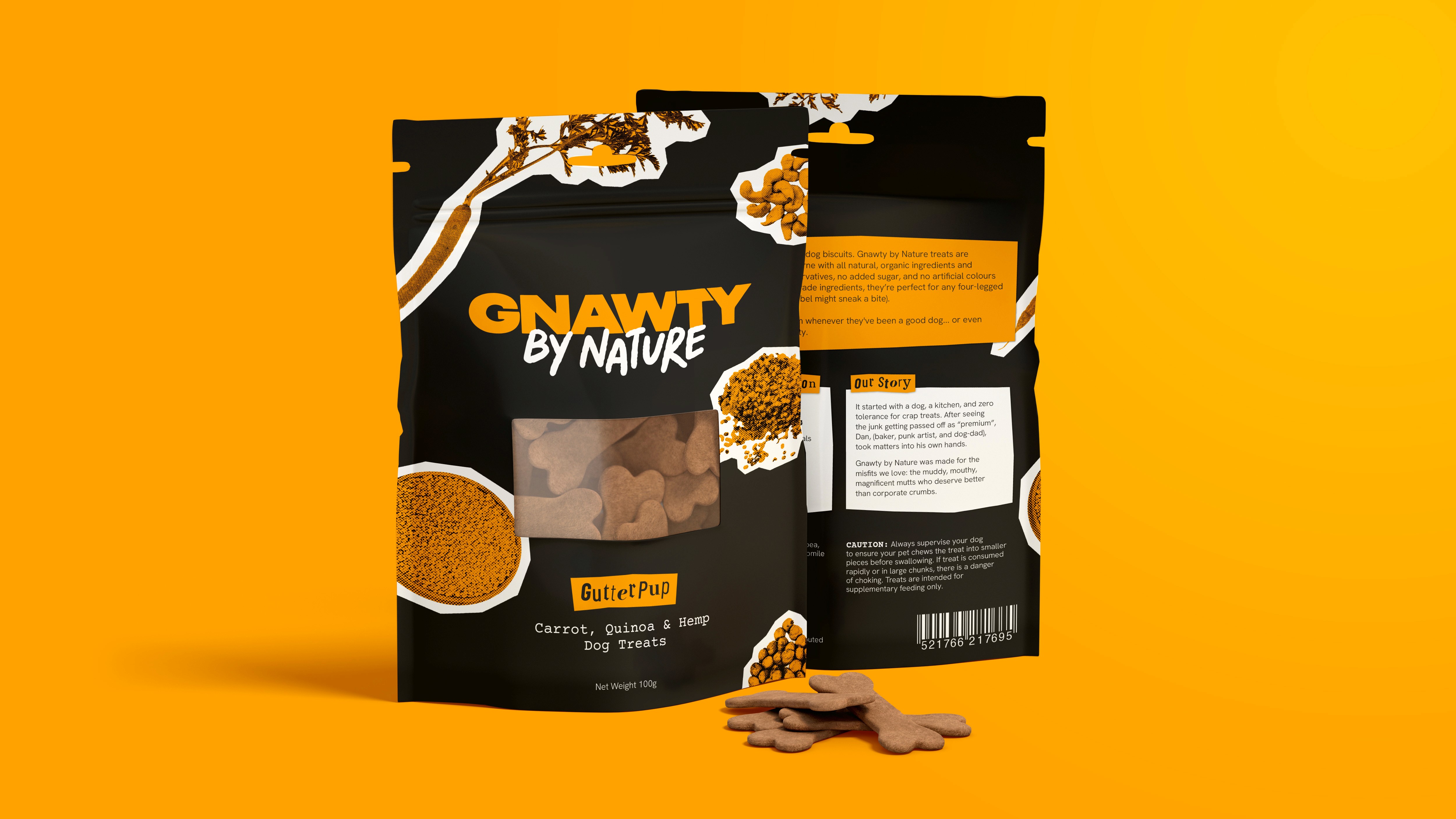

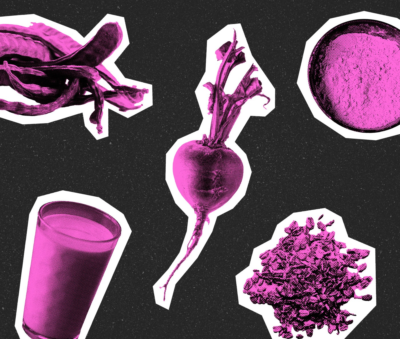

The Subject Matter
Competitor research showed that most dog treat packaging was either cutesy (featuring dog illustrations) or clinical, so in the spirit of the rebellion, the treat ingredients were chosen as the packaging subject matter. This choice helped highlight the fact that the local, ethically-sourced ingredients were the star of the product.
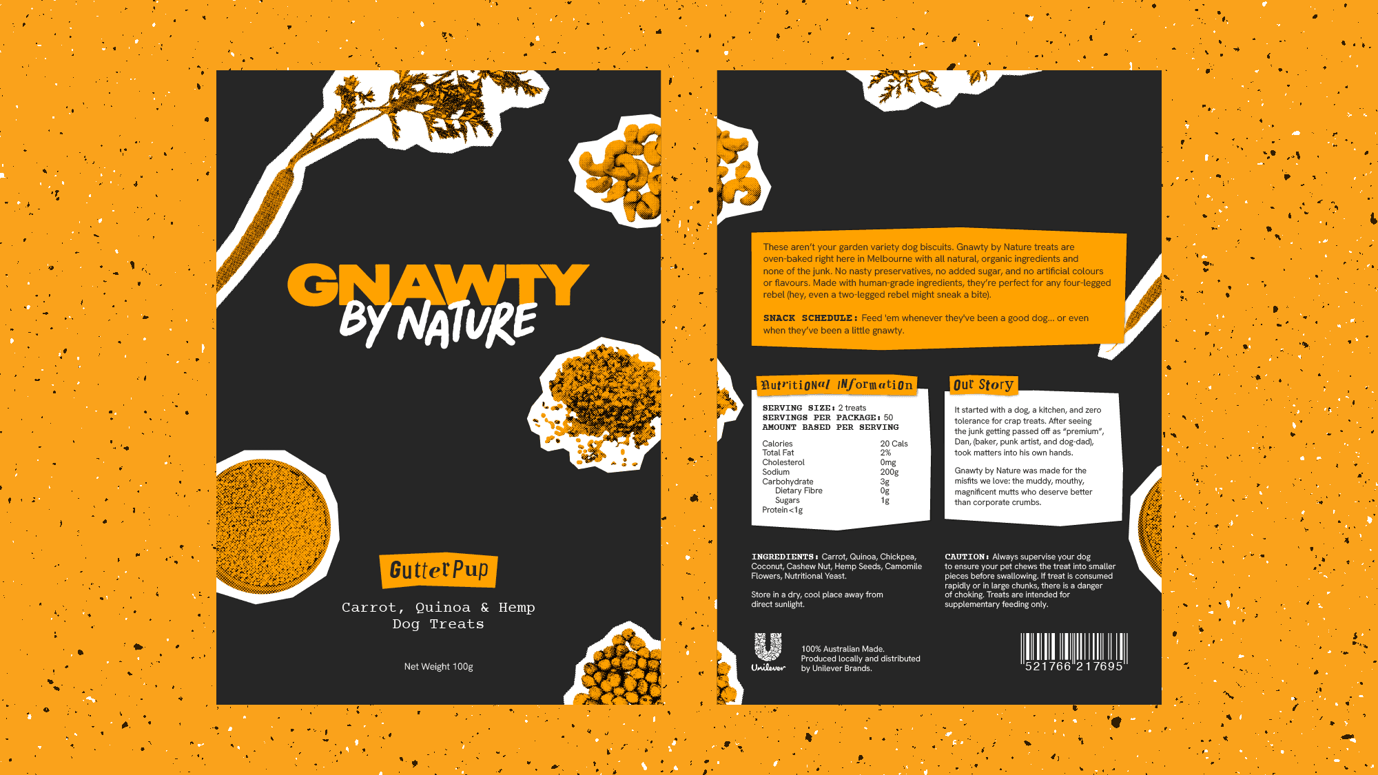

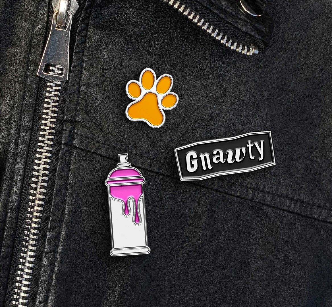
The Visual Identity
The cutout-style typography and sticker bomb aesthetic was chosen as a nod to ’80s punk posters, a classic symbol of rebellion, individuality, and handmade craft, just like Gnawty by Nature treats.
The Visual Identity
The cutout-style typography and sticker bomb aesthetic was chosen as a nod to ’80s punk posters, a classic symbol of rebellion, individuality, and handmade craft, just like Gnawty by Nature treats.
The Visual Identity
The cutout-style typography and sticker bomb aesthetic was chosen as a nod to ’80s punk posters, a classic symbol of rebellion, individuality, and handmade craft, just like Gnawty by Nature treats.


This project was initiated as student work during the Shillington Graphic Design course.
This project was initiated as student work during the Shillington Graphic Design course.
This project was initiated as student work during the Shillington Graphic Design course.
All projects
All projects
Next project
Next project